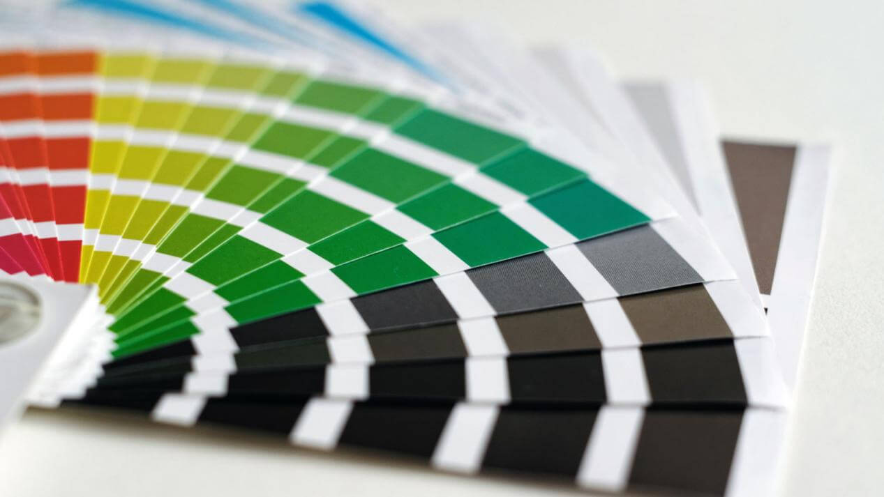
The process of selecting the precise color in the realm of printing is far from being a precise science. Slight variations in results occur due to the specific ink and printing technique employed, thereby complicating the task of color consistency between different projects.
CMYK printing, known for delivering outstanding quality, yields remarkably similar outcomes. Let's explore CMYK, the favored printing method, and learn all the essential knowledge.
In CMYK printing, layered dots of color are employed to mask the white background of the paper, utilizing a subtractive method. By increasing the ink amount, the reflection of light decreases, highlighting the subtractive characteristic of the process.
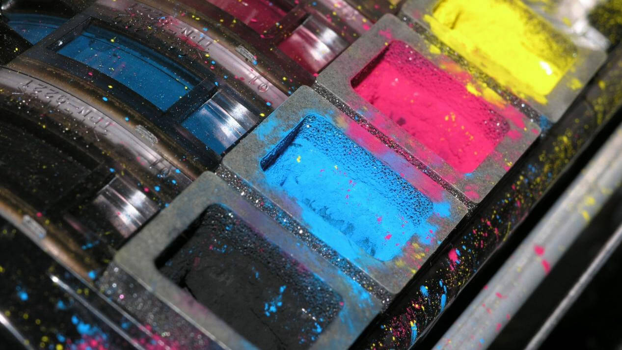
The four colors used in CMYK printing are Cyan, Magenta, Yellow, and Key, which are frequently used for outlining images as a reference guide.
CMYK inks are applied in precise dot patterns, generating the visual perception of a solid color akin to digital image pixels. By layering these dots with varying quantities of ink, one can achieve a diverse spectrum of shades and colors.
What Does Key Mean in CMYK?
The term "Key" refers to the color black, and its usage in the printing process may have originated from this association.
During printing, four colors - cyan, yellow, magenta, and Key (black) - are utilized. The sequence of these colors is important since they are layered upon one another on paper or other ink-receptive surfaces.
Due to the limitation of displaying only one layer at a time, improper alignment between layers can result in a visual artifact known as "banding," which resembles an undesirable rainbow effect. The term "Key" can denote any color plate depending on the specific circumstances encountered during production.
RGB
The color management system of RGB involves the mixing of various shades of red, green, and blue to create colorful images. Converting artwork from its original RGB design to CMYK for print can result in alterations to the colors.
Adobe Photoshop provides the capability to perform this conversion between palettes, but there is no direct or simple method for accomplishing the task.
When a creation is converted from RGB to CMYK and sent for printing, it is highly likely that colors will undergo changes. To mitigate the possibility of colors appearing differently, we recommend designing artwork directly in CMYK from the beginning.
Why is CMYK printing better than RGB?
While RGB offers a wider color spectrum, simplifying the replication of fluorescent and neon colors, designers and printers prefer CMYK due to its capability to reproduce colors as intended in the original artwork.
Professional printers opt for CMYK as it delivers superior outcomes. Colors appear sharper, and images are more vibrant when printed on a white canvas. This is particularly beneficial since the majority of card and paper stocks are initially white.
Why is this distinction important?
The distinction between RGB and CMYK colors is significant. RGB represents "light" colors, while CMYK represents "darkness" colors. This means that CMYK colors can accurately appear on paper without requiring a light source, unlike RGB colors, which need a light source to display accurately on a screen.
When light shines on printed materials, it doesn't reflect in the same way as it does on a screen. Different color variations are necessary for print to accurately convey the intended look envisioned by the designer.
To ensure printing success, it is advisable to begin designing new materials using the CMYK format. In software like Photoshop, the CMYK "mode" can be applied from the start, ensuring transparency about how the piece will appear on paper after the printing process.
How Does CMYK Color Printing Works?
The CMYK color process involves both simplicity and complexity. It begins with the desired design or color intended for printing. The process utilizes subtractive synthesis, similar to mixing paint from scratch. Blending primary colors creates unexpectedly vibrant hues for the project.
This printing method utilizes ink instead of paint, resulting in each layer blending slightly differently. As a result, our eyes perceive subtle gradients between tones and colors rather than fixating on distinct boundaries.
During the printing process, colors on the paper are shaped by the interplay of light reflections. The intensity of these reflections dictates whether a color appears dark or bright on the surface.
Consider this:
when a single ink color is utilized at its maximum level, the resulting impression is black.
When all four colors are intricately layered within an image, a fascinating phenomenon occurs, and white emerges as a captivating presence instead.
The Color Mixture of CMYK
The process of mixing CMYK colors goes beyond the simple act of dipping a brush into the paint and applying it to paper. In various printing
methods, these four colors are translated into minuscule dots that overlap one another, generating a myriad of tones and shades within each color.
During the printing process, the colors are not physically mixed but rather printed as tiny dots of cyan or magenta on top of yellow dots, and so forth. Our eyes perceive these colors as separate entities, even if we desire to have one color blend seamlessly with another. This perception occurs due to the presence of multiple layers, altering the arrangement of the tiny dots from what they would be without any intervening layers.
When preparing to print your design, there are several important factors to consider. When printing on fabric, make sure the colors will reproduce accurately, as some dye-based inks may have difficulty replicating certain hues.
You may need additional enhancements to achieve vibrant reds or unique shades in paper printing.
This involves using different screens, such as bump screens, to optimize the colors before sending the design to an inkjet printer for reproduction.
CMYK Excels in Producing Vibrant Colors for Print
CMYK
color model
stands tall as the undisputed industry standard for printing, drawing its prominence from the intricate interplay between the color space and the very surface it adorns. When ink meets paper, embracing the CMYK color space becomes an imperative step toward unlocking a world of unparalleled printing excellence.
Within the realm of CMYK, a vast spectrum of shades awaits, ready to be embraced and harnessed; without a doubt, CMYK allows your project to surpass the boundaries of ink and paper. It is through its power that your creation for your custom boxes can manifest, adorned with a mesmerizing symphony of rich, vibrant, and luxuriant hues.

 The process of selecting the precise color in the realm of printing is far from being a precise science. Slight variations in results occur due to the specific ink and printing technique employed, thereby complicating the task of color consistency between different projects.