


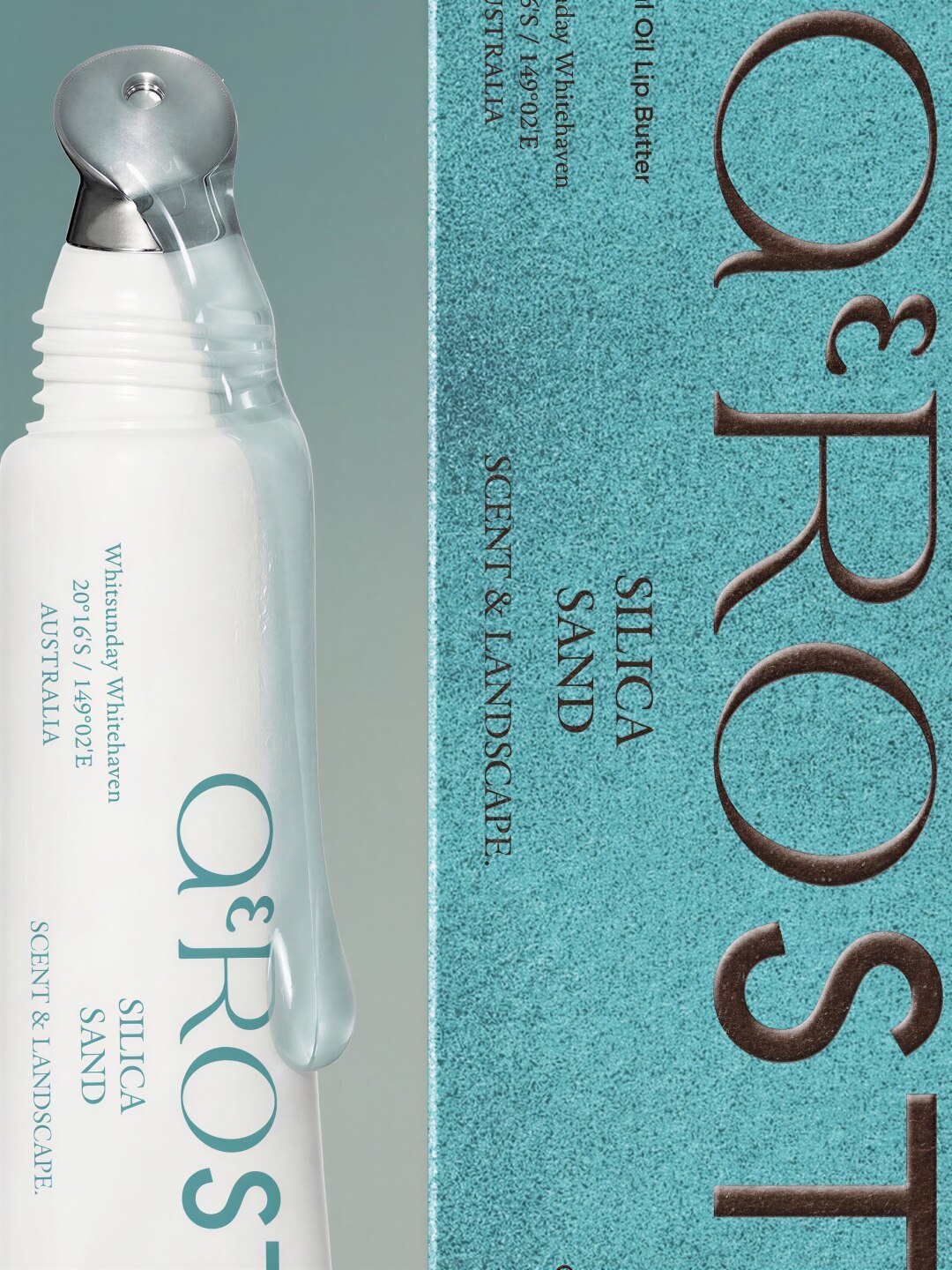
Skincare and cosmetics boxes do two jobs that pull in opposite directions — hold a fragile bottle rigid, and look expensive enough to justify the formula inside.
Beauty packaging has to protect a fragile bottle and sell a price point at once. Start from the filled container: weight, centre of gravity and diameter tolerance. Hold the bottle below the shoulder in the insert, keep 2 mm clearance on every side, and reserve the compliance panel in the dieline before designing the front.
Beauty packaging is the category where the gap between a render and a shipped parcel is widest. A serum bottle is heavy, fragile, often glass, frequently round, and expensive relative to its size. The box around it has to stop it moving, stop it breaking, and still look like something worth photographing on a bathroom shelf.
Get the insert wrong and the bottle rattles. Get the board wrong and the box dents in a mailer. Get the finish wrong and the box scuffs before it reaches the customer — and in a category with 40% return-driven repeat purchase, that first impression is the whole margin.
Three measurements decide the entire structure, and all three come from the filled container, not the design file:
A box designed before these are known will be re-designed. This is why luxury beauty brands specify the container first and the carton second, even though the carton ships first.
SBS board is the default for beauty: white throughout, excellent ink laydown, no grey core showing at the cut edge. 300–350 gsm is typical for a serum carton; 350–400 gsm for larger jars.
Recycled or kraft board suits clean-beauty positioning, but its darker core changes the design rules: pale colours need a white liner or a solid base print, and photographs of the box will show the edge colour.
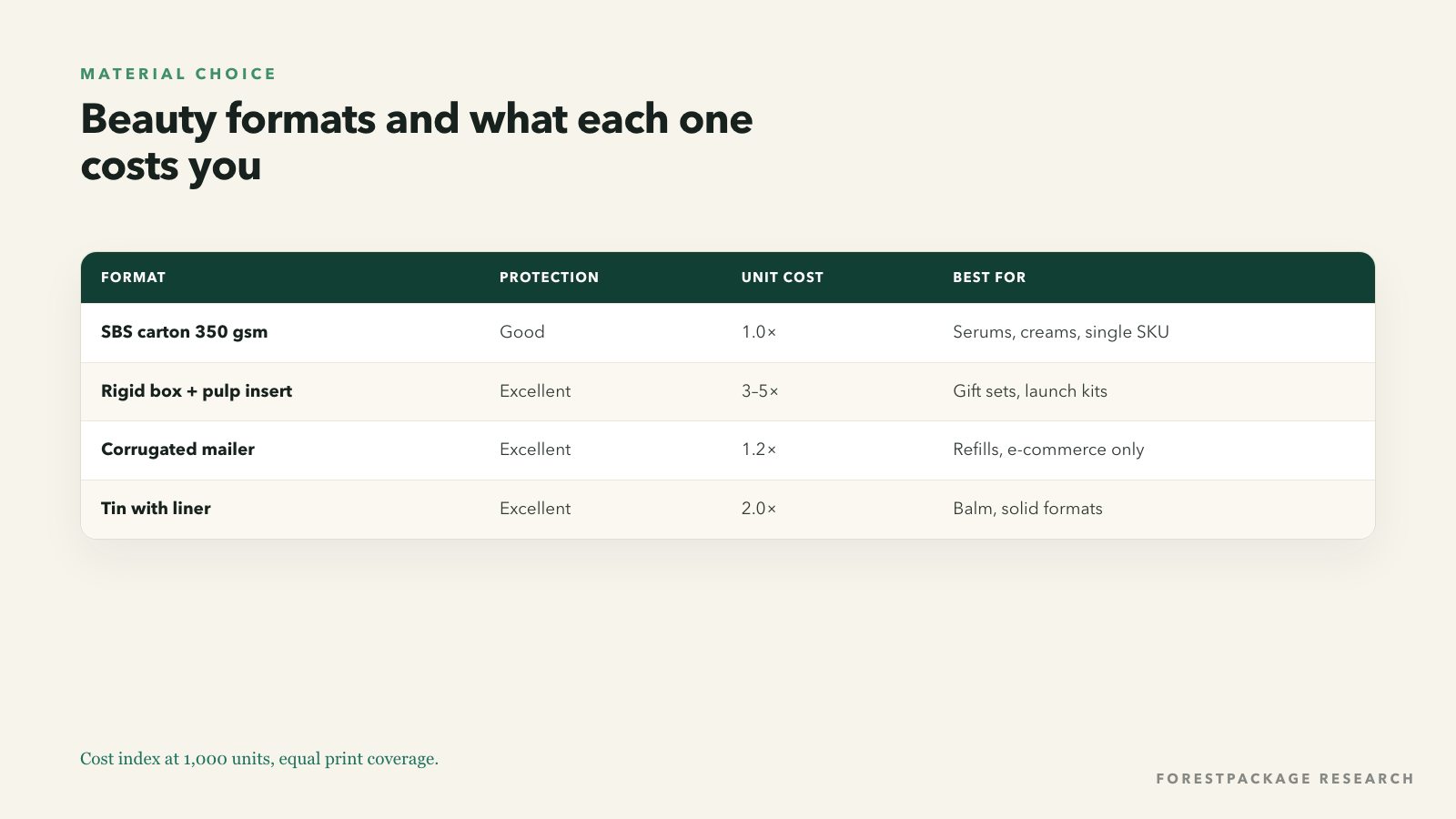
Rigid boxes appear at gift-set level: a greyboard shell wrapped in printed paper, with a foam or pulp insert. The weight and the lid lift justify the price premium when the set contains four products and costs 80 dollars.
Moulded pulp is the sustainable answer for inserts and has improved dramatically: it can be formed to cradle a bottle with the same precision as EVA foam, at a lower unit cost above roughly 1,000 units.
Need this checked against a real structure? ForestPackage quotes custom boxes, inserts and mailers with free structural proofs.
Get a quoteMost beauty packaging failures are insert failures, and they present as three complaints: the bottle arrived leaking, the bottle arrived scratched, or the bottle arrived rolling around in a box that felt empty.
The insert has to do four things:
Folded corrugated inserts do all four cheaply at small volumes. Moulded pulp does them more elegantly at scale. Foam does them best for extreme fragility, at a cost — and with a recycling story that is difficult to defend.
A cream jar in a rigid box looks premium on a shelf, but the moment it ships the lid loosens. The insert is the product. Comment on a skincare packaging post
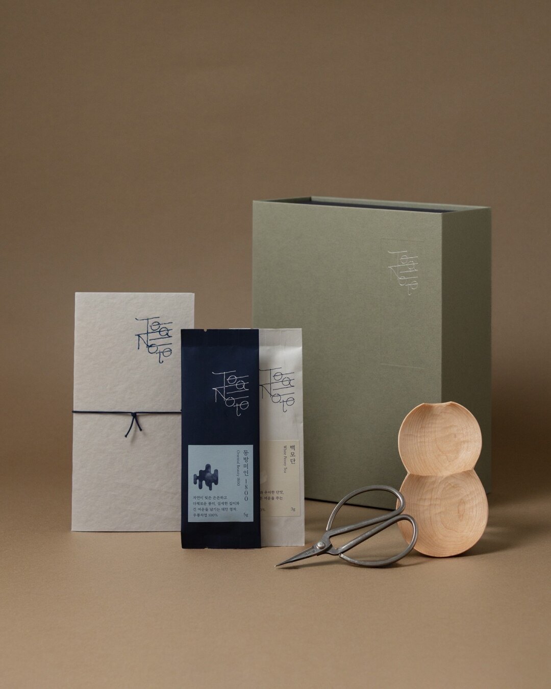
The beauty posts with the highest engagement share a visual grammar, and it is not "more gold foil".
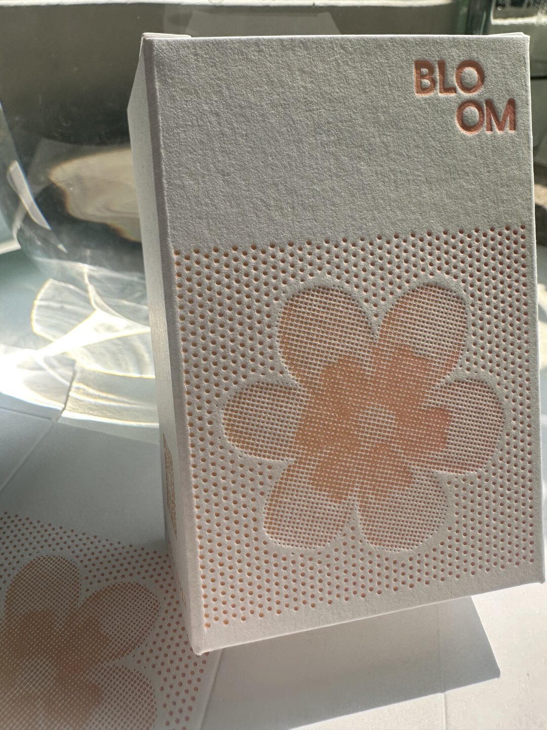
Cosmetics cartons carry mandatory information: net content, ingredient declaration (INCI), batch code, PAO symbol, manufacturer or responsible person, country of origin, and any warnings. In the EU this copy must be on the primary or secondary packaging and must remain legible — which sets a floor on type size and a ceiling on decoration over that area.
The practical advice: reserve a copy panel in the dieline before designing the front. Brands that design first and add compliance later end up shrinking the logo or moving it, which is why so many beauty boxes look like the logo was an afterthought.
Beauty is moving toward refillable compacts and bottles, and refill formats change the box economics: the outer shell is bought once, the refill arrives in a lighter carton, and the packaging cost per use falls sharply. The design consequence is that the outer box must survive repeated handling and stay presentable for months on a bathroom shelf — which argues for rigid or heavy-board construction, coated edges and a closure that does not loosen.
If refills are on the roadmap, design the outer box for a two-year life now. Retrofitting durability later means re-tooling the structure, not just reprinting it.
A cream jar in a rigid box looks premium on a shelf, but the moment it ships the lid loosens. The insert is the product.
Everything arrived intact, and the box held the bottles so tightly that nothing moved. That is the only reason I would order again.
The best beauty packaging in the sample is not the most decorated. It is the box where the bottle does not move, the copy is legible, and the surface invites a hand. Everything else — the foil, the pattern, the ribbon — is optional once those three are true.
Because the insert was designed after the box was chosen. An insert that grips the body lets the cap lever against the lid; one that leaves 5 mm of clearance lets the bottle build momentum. The fix is structural: measure the filled container, hold it below the shoulder, and keep 2 mm clearance on every side.
Net content, INCI ingredient declaration, batch code, period-after-opening symbol, manufacturer or responsible person, country of origin and any warnings. That copy is roughly a third of the back panel, so it has to be reserved in the dieline rather than added after the design is approved.
Not for single SKUs — a 350 gsm SBS carton with one tactile finish reads premium and ships cheaply. Rigid boxes earn their cost on gift sets and launch kits, where the lid lift and weight carry the price. Most brands need both: a carton for the SKU, a rigid set for the season.
Send a size, a quantity and a deadline. You will get a costed answer with a dieline, a material recommendation and a production calendar — not a brochure.
Method. This series reads 377 posts, including 28 beauty and cosmetics packaging posts on packaging design, materials and small-batch production, plus the comment threads underneath them. Quotes are translated from Chinese and lightly edited; account names are withheld. Photographs are published by their creators on Xiaohongshu and are used here as illustrative references — clear rights with the creator before any commercial republication.
Written for forestpackage.com — custom boxes, rigid boxes, mailers and inserts, produced in the USA and China.
Approx. 1,128 words · 5 photographs · 1 data figure

Subscribe to our
Enter your email address and enjoy exclusive access to special offers and news.


The shape and palette are genuinely creative. What I want to know is how the insert stops the bottle from rattling, because that is where most beauty packs fail.