


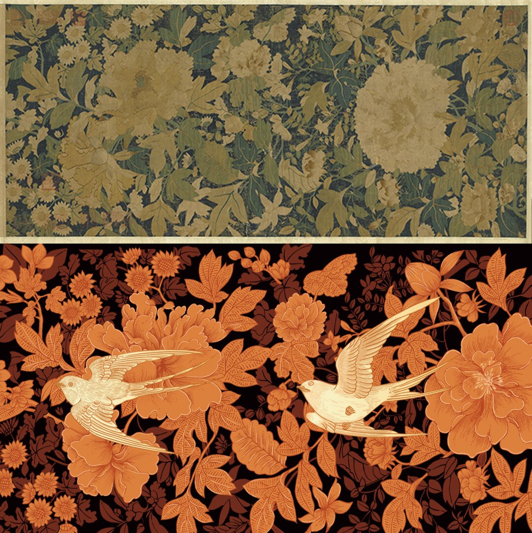
Six passes through six machines can double the price of a carton. Two of them will do most of the work of making it feel expensive.
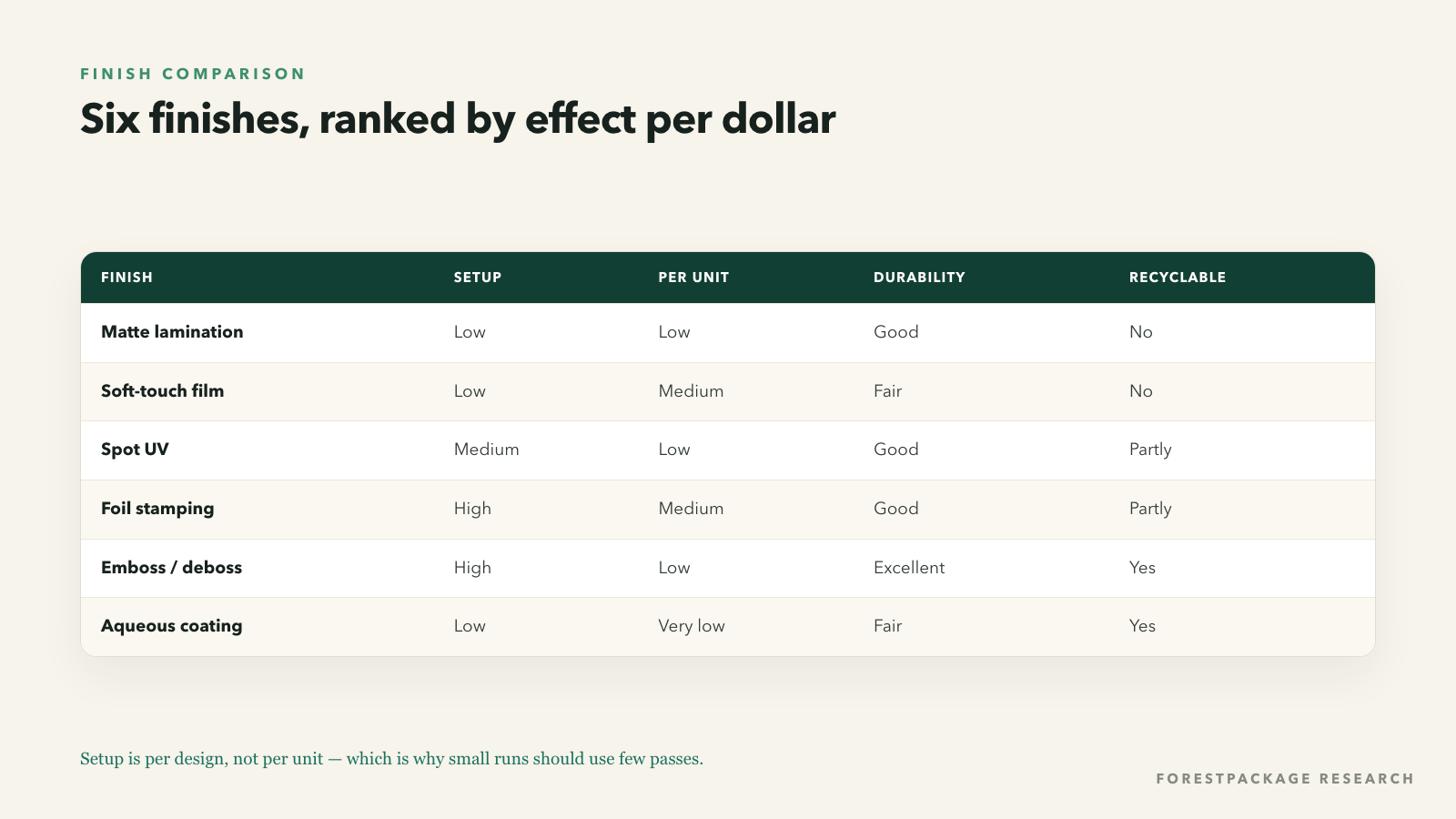
Two finishes do most of the work of making a box feel expensive: a matte or soft-touch lamination for the surface, and one precise structural detail such as a deboss or spot UV. Every additional pass adds a minimum charge per run, which is why five finishes on a 300-unit order often costs more than the board itself.
A designer once described packaging finishes as "the difference between a box and an object". That is accurate, and also the reason so many first orders are over-specified. Every finish is a separate production pass with its own setup cost, its own failure modes and its own effect on how the box photographs, feels and survives a mailer.
The goal is not the most finishes. It is the smallest number of passes that produces the intended effect — which is usually one structural pass and one surface pass, chosen deliberately.
Matte lamination. A thin film bonded to the printed sheet. It kills reflections, deepens colour and makes the box feel soft. It is also the most reliable way to make a mid-priced carton read as premium. The cost is modest and the effect is immediate. Its downside: plastic film complicates recycling, and it scuffs more visibly than gloss.
Soft-touch lamination. A velvety film with a slightly rubbery hand-feel. It is the single most recognisable "luxury" signal in modern packaging, and it shows fingerprints. It costs more than matte and is less durable — a soft-touch box that travels unprotected will look worn.
Spot UV. A gloss varnish applied to selected areas, usually over a matte base. It creates contrast without adding a layer, and it is the cheapest way to make a logo catch the light. Requires a separate screen or plate, so it is a fixed cost per design.
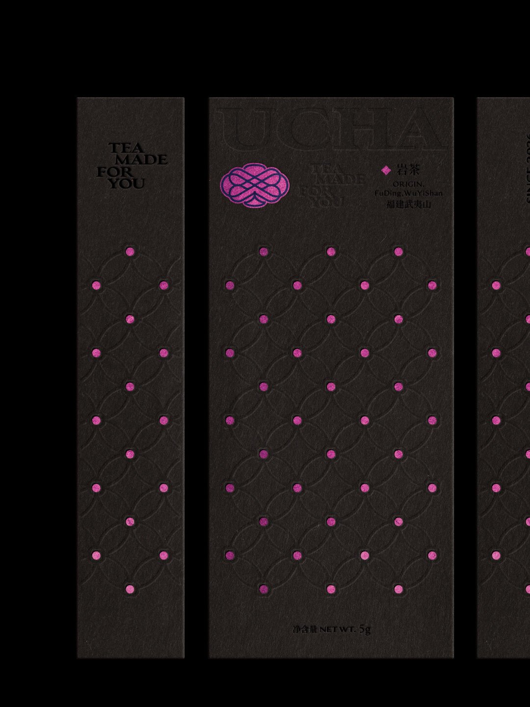
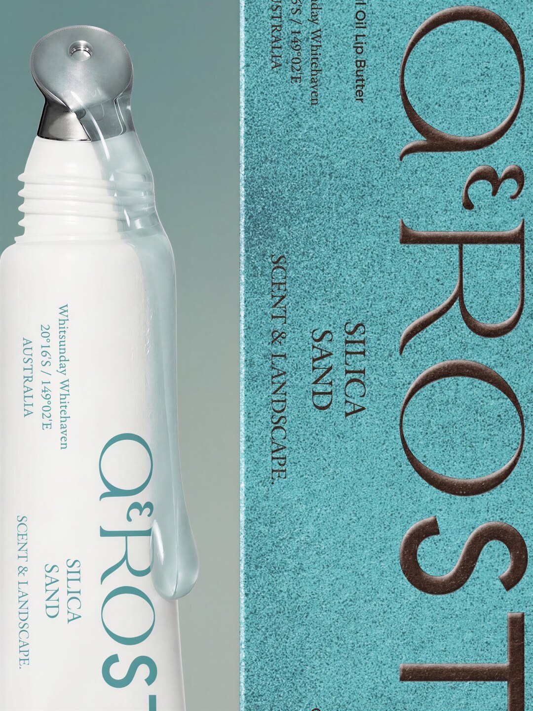
Foil stamping. A heated die presses metallic film into the sheet. Genuinely reflective, genuinely premium, and genuinely expensive at low volumes because the die and setup are per-design. Foil on a dark uncoated stock is the classic combination; foil on a coated stock can look cheap.
Embossing and debossing. A die raises or sinks an area of the sheet. It is tactile rather than visual, which makes it effective on boxes people hold. Deboss is the safer choice on thin board; emboss on 300 gsm can telegraph through to the inside.
Aqueous coating. A water-based varnish, cheap, recyclable-friendly and protective against scuffing. It is the sensible default for brands who want durability without film.

Offset printing spreads a large fixed setup across many units; digital printing has almost no setup and a higher per-sheet cost. The crossover for a typical four-colour carton sits somewhere between 500 and 1,500 units, depending on size and stock.
The consequence for finishing is less obvious. Digital presses print with toner or inkjet inks that behave differently under lamination and foil: some films will not adhere cleanly, and foil adhesion can fail at the edges. If your finish list is ambitious, offset is usually the safer press — and if your quantity is small, a reduced finish list is usually the safer strategy.
Need this checked against a real structure? ForestPackage quotes custom boxes, inserts and mailers with free structural proofs.
Get a quoteWe looked at which details the highest-engagement packaging posts lingered on. The pattern was consistent, and it was rarely "more finishes".
The plate itself is ordinary, but the packaging is gorgeous. I kept the box and threw away the product, which probably says something. Buyer, premium box review
Every finish introduces risk, and the risks are what turn a proof into a reprint.
Cold-chain products need a different material, and the belly band needs an overlap allowance built into the artwork. Two things that are very easy to forget until the proof comes back wrong. Production manager, packaging thread
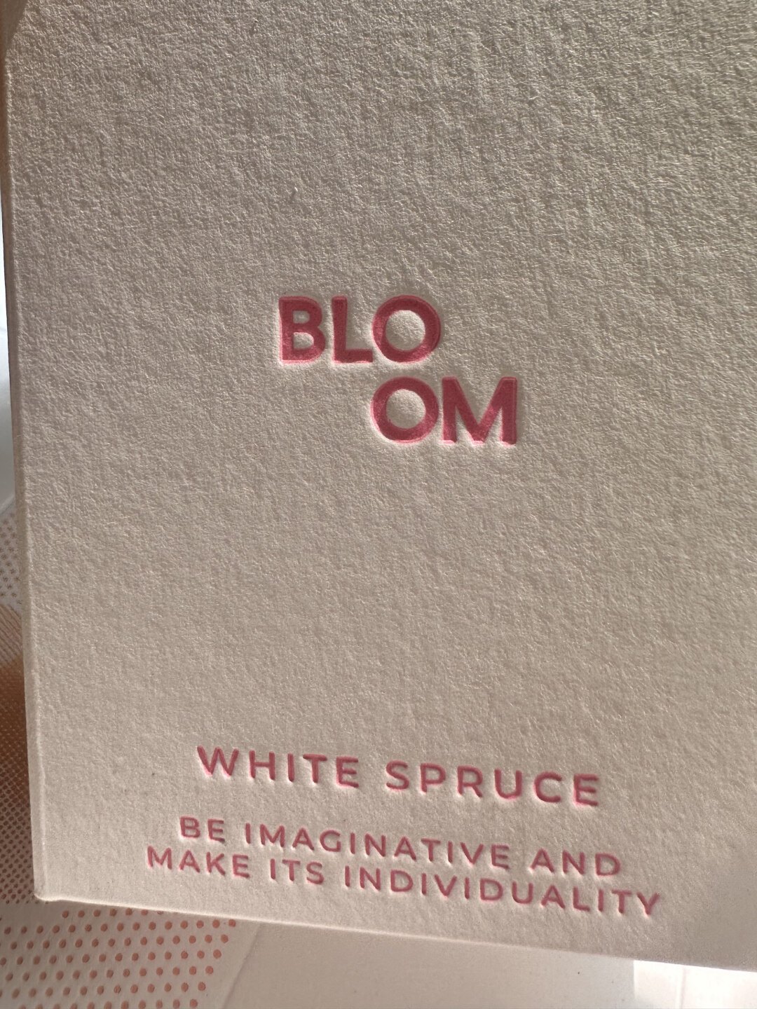
Under a dollar a unit. One aqueous or matte coating, one or two print colours, no foil. Spend the money on board weight instead.
One to three dollars a unit. Matte lamination plus spot UV on the logo. This is the sweet spot for most DTC brands: it photographs well, feels considered and survives a mailer.
Above three dollars a unit. Soft-touch or foil on a rigid box, with a debossed or foiled mark. At this level the box is part of the product, and the finish budget should be treated as marketing spend, not packaging spend.
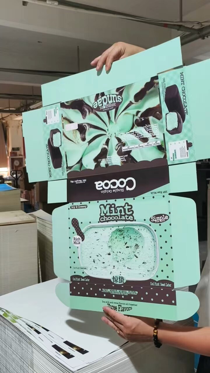
The colour came out beautiful — this exact shade of mint is hard to hit and they nailed it. The previous supplier's version was noticeably grey.
The plate itself is ordinary, but the packaging is gorgeous. I kept the box and threw away the product, which probably says something.
The most expensive box in a category is rarely the best-looking one. It is usually the one that chose two finishes and executed them precisely, on a board heavy enough to feel like a decision. Everything beyond that is a cost the customer cannot see.
Matte lamination plus spot UV on the logo. Matte deepens colour and kills reflections for a modest cost; spot UV adds contrast without another material. Together they photograph well and survive normal handling, which foil and soft-touch do not always do inside a mailer.
Yes. Toner and inkjet inks behave differently under film and foil: some laminates will not adhere cleanly and foil can fail at the edges. If the finish list is ambitious, offset is the safer press; if the quantity is small, a shorter finish list is the safer strategy.
Because the foil die was not matched to the stock. Foil adheres where pressure and heat meet the sheet; on textured or recycled board the low spots miss. The die and the paper have to be chosen together, and a proof on the actual stock is the only reliable check.
Send a size, a quantity and a deadline. You will get a costed answer with a dieline, a material recommendation and a production calendar — not a brochure.
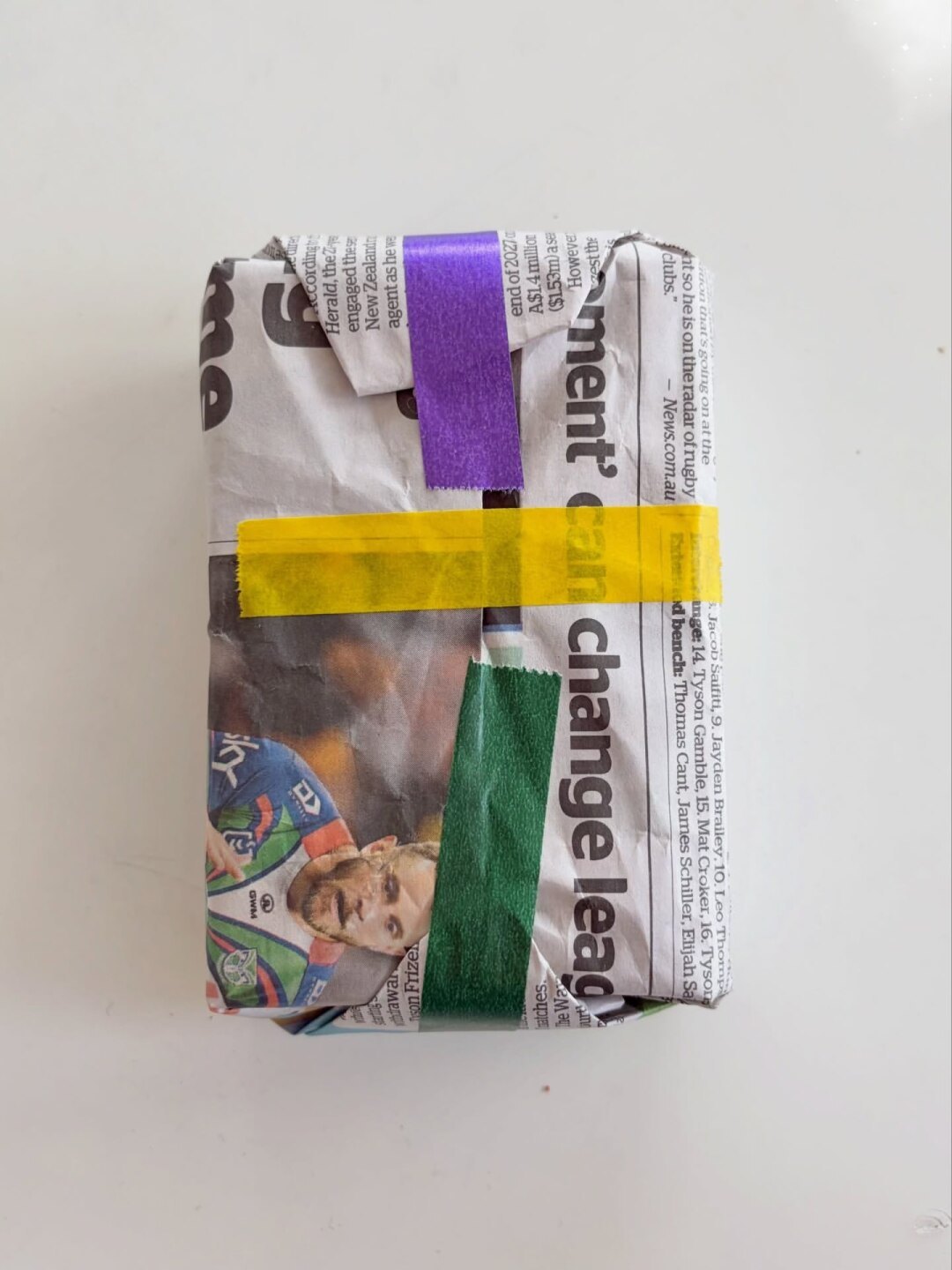
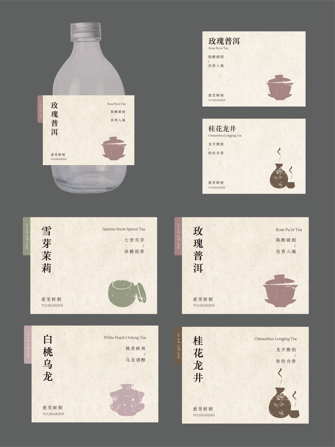
Method. This series reads 377 packaging posts on print and craft on packaging design, materials and small-batch production, plus the comment threads underneath them. Quotes are translated from Chinese and lightly edited; account names are withheld. Photographs are published by their creators on Xiaohongshu and are used here as illustrative references — clear rights with the creator before any commercial republication.
Written for forestpackage.com — custom boxes, rigid boxes, mailers and inserts, produced in the USA and China.
Approx. 1,159 words · 5 photographs · 1 data figure

Subscribe to our
Enter your email address and enjoy exclusive access to special offers and news.


The pull-out drawer slides and the pattern moves as the box opens. That is the whole trick — and it costs almost nothing extra once the dieline is right.