


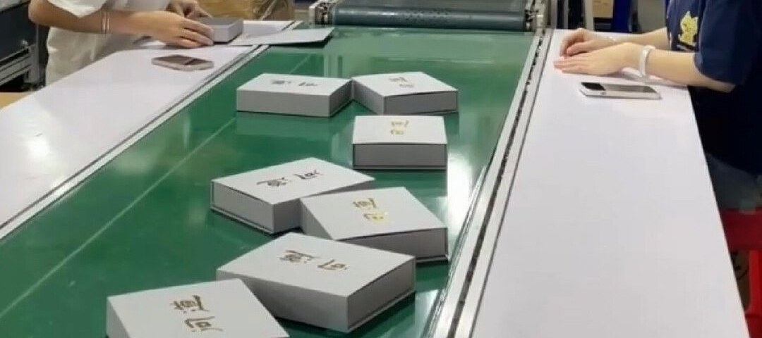
Most reprints are not caused by bad design. They are caused by six pages of artwork meeting one page of dieline and nobody checking the difference.
A prepress checklist has twelve items, and the first four catch most reprints: artwork and dieline share one page size, 3 mm bleed on every edge, dielines on their own layer in spot colour, and no stroke drawn on the trim. Everything after that is barcode quiet zones, minimum type size, ink coverage and insert clearance.
There is a specific kind of silence in a factory when the first printed sheet comes off the press and the logo is 4 mm to the left of where it should be. It is not a dramatic failure. It is a slow, expensive one: the die is already cut, the board is already bought, and the only remaining decision is how much of the run to accept.
Prepress is the cheapest place to find problems and the only place where finding them is still free. These twelve checks cover the failures that actually reach production — not the theoretical ones.
1. One page size. The artwork and the dieline must share the exact page dimensions. When they do not, the imposition software silently scales one of them. Every element shifts by a percentage, and percentage shifts are invisible on screen.
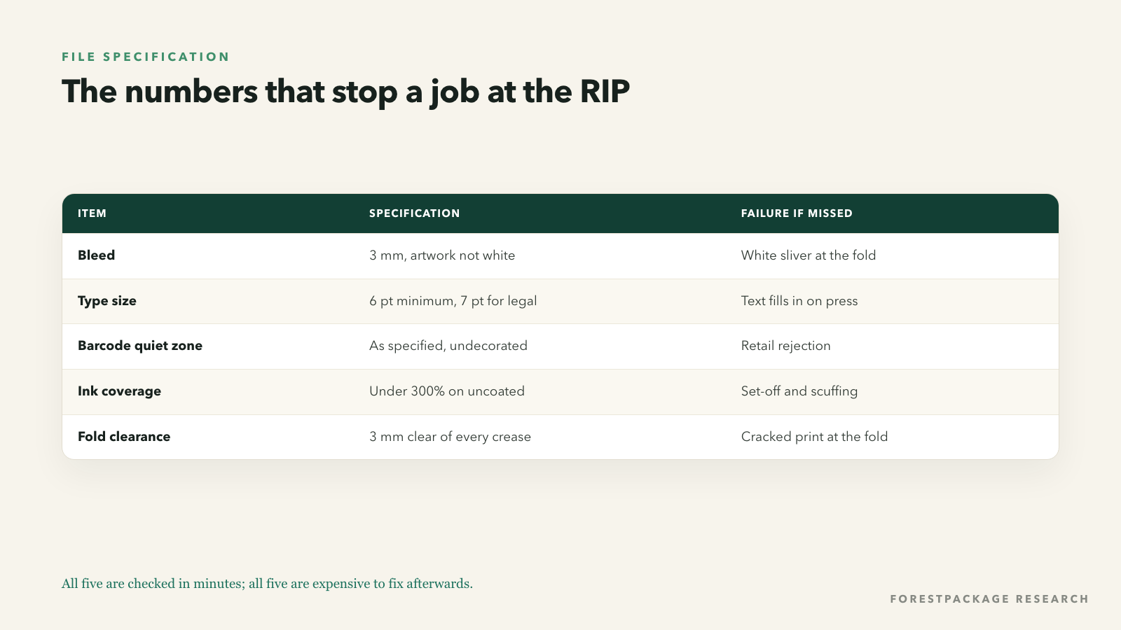
2. Bleed on every edge. Three millimetres beyond the trim line, and it must be actual artwork, not white. A carton with bleed on the front panel and none on the dust flaps will show a white sliver at the fold.
3. Trim, safe and fold lines are separate layers. Printers need the dieline as spot colours or named layers, not as part of the image. Artwork that includes the dieline as a visible line will print the dieline.
4. No strokes on the trim. A 1 pt outline drawn on the die line looks helpful and prints as a hairline frame around the finished box.
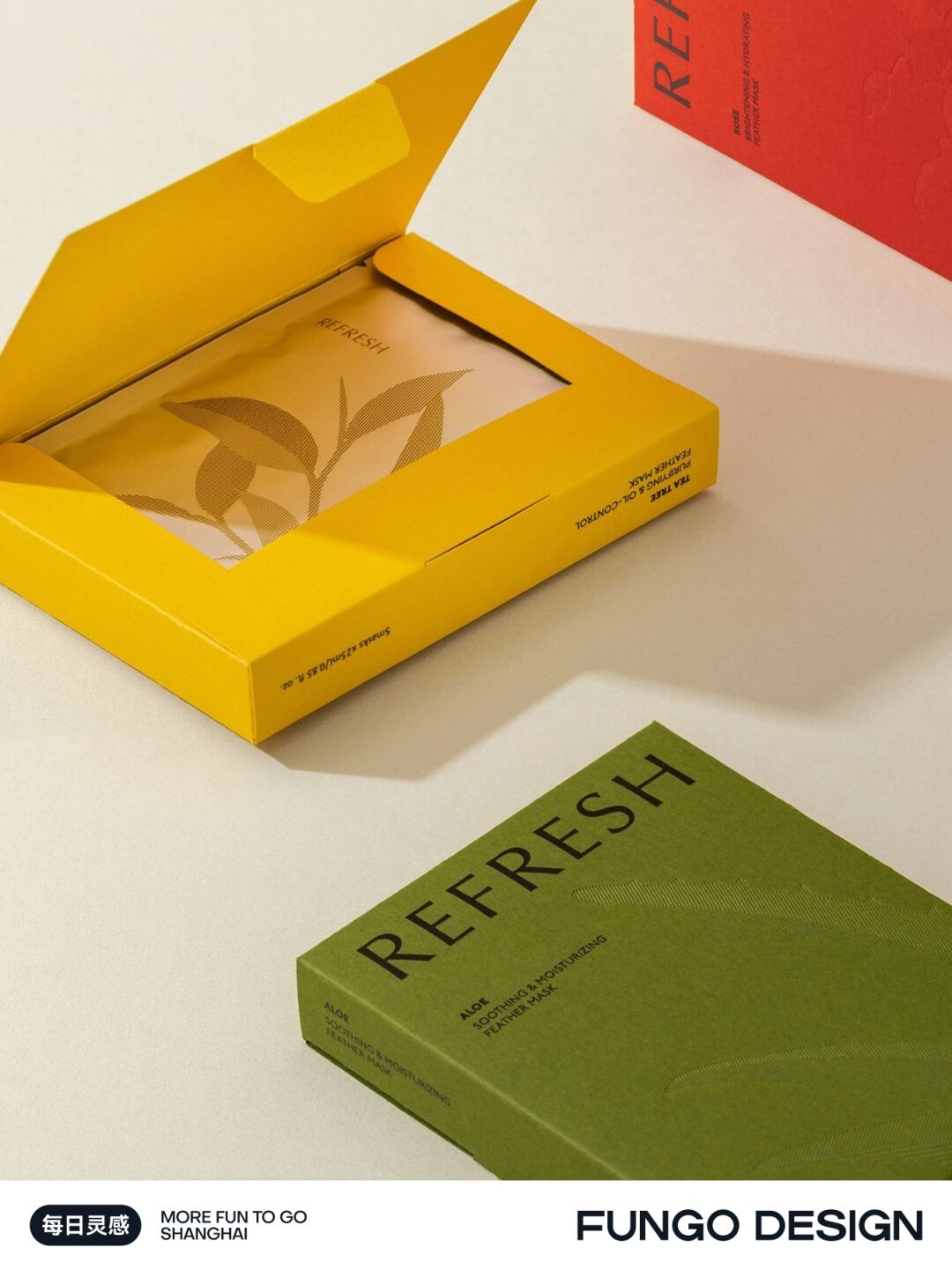
5. Minimum type size. Below roughly 6 pt, reverse-out text fills in and small serif faces break up. If the copy is legally required, 7 pt is a safer floor.
6. Barcode quiet zone. The blank margin around a barcode is specified, not optional. Decoration that crowds it makes the code unscannable at retail, which is a hard rejection at most retailers.
7. Ink coverage. Total area coverage above about 300% on uncoated stock causes set-off, slow drying and scuffing. Large solid black areas should be built as rich black with a controlled total, not 100% on all four plates.
8. Text inside the fold. Anything within 3 mm of a crease will be distorted or cracked, especially with lamination. Move it or accept the crack.

Need this checked against a real structure? ForestPackage quotes custom boxes, inserts and mailers with free structural proofs.
Get a quote9. Insert clearance. The product plus insert must clear the box by at least 1.5–2 mm on every side. A tolerance stack of board thickness, glue flap and print gain eats that clearance faster than designers expect.
10. Glue flap artwork. The glue flap is visible when the box is open. Artwork that runs a solid colour across it will show a seam on the inside lid.
11. Grain direction. Board folds cleanly along the grain and cracks across it. On a tall carton, the grain should run vertically so the crease on the long edge does not split.
12. Shipping marks and legal copy. Importer address, country of origin, recycling marks and any category-specific warnings belong in the artwork, in the right language, in a size that survives a 20% reduction.
Sending a sample first is not a formality. The one time we skipped it, the barcode landed on a fold and the whole run had to be reprinted. Commenter, factory tour post
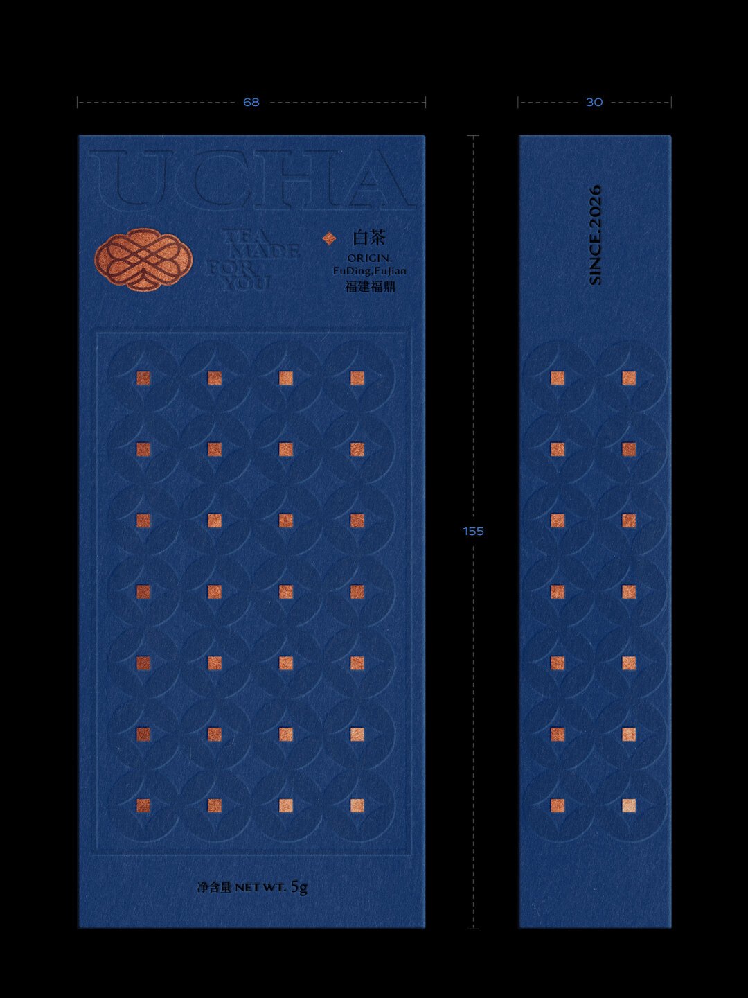
A digital PDF proof confirms layout. It does not confirm colour, substrate behaviour or finish adhesion. A physical proof — even a single sheet printed on the actual stock — is the only way to see how ink sits on a textured or recycled board.
For anything above a few hundred units, ask for a press proof: a sheet pulled from the actual run, before the run continues. It costs a fraction of a reprint and it is the last point at which the job can be changed for free.

A production-ready handoff contains: artwork as PDF/X-4 with fonts embedded, the dieline as a separate file in the same page size, a colour list (Pantone references, not screenshots), a finish map showing which areas receive which treatment, and a text file of the exact copy and legal lines. Suppliers who receive this folder quote faster, proof faster and reprint less.
The single highest-leverage artefact in a packaging project is a one-page handoff that travels with the files: who approved what, on which date, against which dieline version, on which stock, with which finishes. When a dispute arises three weeks later — and something always does — this page is the difference between a conversation and a reprint.
Keep it versioned. "Final_v3_approved" in a filename is not a version control system; a date and a sign-off line is.
Sending a sample first is not a formality. The one time we skipped it, the barcode landed on a fold and the whole run had to be reprinted.
Can you produce a sample before I commit? I would rather pay for a proof than for 500 boxes I cannot use.
Every check on this list is boring. That is the point. The interesting failures — the wrong colour, the cracked fold, the barcode that will not scan — are all the residue of a boring check that was skipped, and each of them costs more than the entire prepress stage.
Artwork built on a different page size than the dieline. When the imposition software silently scales one of them, every element shifts by a percentage that is invisible on screen and obvious on the die-cut sheet. It is also the cheapest failure to prevent — one comparison at 100% zoom.
3 mm beyond the trim line on every edge, and it must be actual artwork rather than white. Cartons with bleed on the front panel but not on the dust flaps show a white sliver at the fold, which reads as a manufacturing defect to the customer.
A PDF confirms layout, not colour, substrate behaviour or finish adhesion. For anything above a few hundred units, ask for a sheet pulled from the actual run on the actual stock. It costs a fraction of a reprint and it is the last point where the job can be changed for free.
Send a size, a quantity and a deadline. You will get a costed answer with a dieline, a material recommendation and a production calendar — not a brochure.
Method. This series reads 377 posts and 896 comments on production and craft on packaging design, materials and small-batch production, plus the comment threads underneath them. Quotes are translated from Chinese and lightly edited; account names are withheld. Photographs are published by their creators on Xiaohongshu and are used here as illustrative references — clear rights with the creator before any commercial republication.
Written for forestpackage.com — custom boxes, rigid boxes, mailers and inserts, produced in the USA and China.
Approx. 1,116 words · 5 photographs · 1 data figure

Subscribe to our
Enter your email address and enjoy exclusive access to special offers and news.


Cold-chain products need a different material, and the belly band needs an overlap allowance built into the artwork. Two things that are very easy to forget until the proof comes back wrong.